
Ok, we’re just missing cabinet pulls, lighting, art…The fun stuff! I ordered cabinet pulls but something mysterious has happened to the order so I think I need to try again.
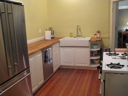
I also need to do some more treatments of the counter to make sure it has a good thick finish on it. But at least we have cabinet doors! I also added a couple more recent living rooms pictures to the apartment Flickr set.
—-
Big thanks to Scrappy Girl and Another Shade of Gray, both of whom have given nice links to the blog in the last couple days! I’m touched and flattered; I love both of their blogs.
Xander, a world traveler who is currently living in Bangkok, writes about travels, food, and culture at his blog Primitive Culture. I am always fascinated by the gorgeous photos he posts of daily living around the world–he has a great eye and captures a lot of details that you don’t see in vacation pictures. Today he launched a new series, Bangkok Colors, which I think is going to be so inspirational. Today: Pink! All those pinks and spring greens are so preppy and the opposite of the autumnal colors that surround us here in Boston right now. Fun.
And finally, a random obsession. I loved love love white ceramic and porcelain stuff, and have been slowly building up a few pieces at home. In today’s House and Home section there was a fun slideshow about hits and busts at various home stores, and I was pleased to see the porcelain logs that I adore posted as a hit. The same shop, Koo de Kir, said a Jason Miller porcelain Hostess Cupcake was a total bust for them. But I love it (it’s down at the bottom)! So fun.
(photo from Koo de Kir)
I love the paint on the walls! What color is it? I searched back through your posts and couldn’t find anything on it. I’d love to paint my kitchen that color. Thanks!
Sorry, I put the paint names in the Flickr pool, and forgot to add them to the blog posts. It’s “Beacon Hill Damask,” from the Benjamin Moore Historic Colors collection.
Thanks!
I love the paint color of you living room– what color of gray is that? Did you worry whether it would make the room appear darker? — it is lovely and really adds such definition to the room!
And I just love the colors in xander’s photography…..
It’s Silver Fox, by Benjamin Moore. I didn’t want to go too dark but the room really did need something to make the mouldings pop. I tried to find a mid-tone that wouldn’t make it cave-like (I chose a darker color for the dining room, which is always dark and is mostly used at night, so I didn’t mind a dark color for coziness).
Congrats, Kate! What a lovely finished product – isn’t it magnificent to have counter space? That is such a beautiful apartment, by the way – it looks so cozy and wonderful to live in…
Congratulations, Kate! It’s gorgeous, gorgeous, gorgeous! I swear I read your blog at lunchtime and then I eat so much more than I normally would. Let me know how you like the sink. I have to start on the kitchen soon.